Connecting Hearts and Paws: Upgrading Our Website for Impact
Competitive Analysis
We conducted a competitive analysis on both animal shelters and rescue websites that share the common goal of saving dogs from euthanasia and abuse. This helped us recognize areas for improvement and gain inspiration.
With a mission to rescue and rehabilitate at-risk animals, SDAS aims to...
Redesign the website for better navigation to showcase adoptable pets
Develop a strong brand identity with a polished logo and consistent branding
Improve marketing through content & social media to increase adoptions & donors
how we started
Low Fidelity
Our priorities were to use unnecessary white space, address specific user pain points (like fostering vs. adopting), develop a sort and filter solution, and add more testimonials and statistics.
from confusion to clarity
Key Findings & Improvements
Quantitative Data
Our usability testing process used three key components: pre-test questions to understand the user's initial impressions, scenario tasks to observe users navigating key site sections and post-test questions after interacting with the high-fidelity prototype to capture feedback on their overall experience.
This combination of qualitative feedback and quantitative data directly informed key improvements for an optimal user experience.
Navigation: During testing, some site navigation like the sort/filter bar was difficult to find or use.
Branding: Per the client's request, we will remove the phone number from the Contact page. To better communicate their nonprofit status, their 501(c)(3) number will be added to the footer.
Visuals: The volunteering page photos will be updated to feature relevant images showcasing dogs and other animals.
Findings from Usability Testing:
FINDING OUR NPO'S BRANDING IDENTITY!
How we rehauled branding, refined tone, and refreshed marketing
To foster a sense of warmth and playfulness, we’ve introduced custom illustrations that infuse the site with fun and friendliness!
We opted for Plus Jakarta Sans, a modern typeface that perfectly balances legibility and approachability.
Our logo design is meant to look like a scout patch which pays homage to the spirit of scouts—for boys, girls and everybody in between—symbolizing the duty and achievements of caring for your community (in this case rescuing dogs in need).
Before
After
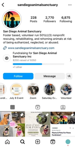
As Instagram has become the primary platform where users engage with and learn about SDAS, we focused our social media strategy here. Tailoring content for Instagram will also showcase SDAS on their linked Facebook, expanding reach.
Following a style guide similar to the website’s colors, we created templates for both posts and stories for SDAS to have consistent branding on their Instagram page, using Canva as the platform as it is the most accessible to them. SDAS expressed that they wanted their branding to be beach-like, bright, and fun, so we kept that in mind when creating the marketing materials.
Before
After
final screens
Page Spotlights
The following pages showcase each tab of the website, and how we improved it from the original based on two rounds of usability testing, optimal user experience, and a new information architecture.
We used Squarespace to redesign the website prototype and then implemented changes to align the live site with the prototype design. Squarespace's limitations required customization. We added CSS and JavaScript code to match padding, margins, button styles, fonts, and other elements to the prototype. To enable easy future dog profile additions, we created templates for the non-profit organization to use.
An interactive "Happy Tails" carousel and an Instagram gallery keep the community informed
About
We created an easy-to-use sort and filter bar, clearly differentiated between adopting and fostering.
Adopt/Foster
We made profiles internal instead of linking to Petfinder and included FAQs about the adoption/fostering process
Pet Profiles
We placed the donate button directly on the banner, explained how donations help the sanctuary
Donate
ROLE
UX Designer
Marketing Strategist
2 Designers
1 UX Researcher
2 Marketing Strategists
team
role
Timeline
tools
User research
Empathize with Users
We conducted 11 unstructured user interviews and observed interactions with the original website. We documented users' thoughts, actions, and reactions on a Mind Map to explore trends and patterns.
San Diego Animal Sanctuary (SDAS) is a new 501(c)(3) non-profit animal rescue and sanctuary founded in 2021 and located in San Diego, California. As a volunteer-run organization, SDAS is dedicated to rescuing dogs and other animals facing euthanasia, homelessness, neglect, or abuse.During the summer of 2023, I participated in UP-Grade, an innovative initiative run by Design Co at UCSD. This 10-week summer program pairs students with local nonprofit organizations, offering a unique opportunity to enhance these organizations' branding and increase their community visibility.
San Diego Animal Sanctuary (SDAS) is a new 501(c)(3) non-profit animal rescue and sanctuary founded in 2021 and located in San Diego, California. As a volunteer-run organization, SDAS is dedicated to rescuing dogs and other animals facing euthanasia, homelessness, neglect, or abuse.During the summer of 2023, I participated in UP-Grade, an innovative initiative run by Design Co at UCSD. This 10-week summer program pairs students with local nonprofit organizations, offering a unique opportunity to enhance these organizations' branding and increase their community visibility.
San Diego Animal Sanctuary (SDAS) is a new 501(c)(3) non-profit animal rescue and sanctuary founded in 2021 and located in San Diego, California. As a volunteer-run organization, SDAS is dedicated to rescuing dogs and other animals facing euthanasia, homelessness, neglect, or abuse.During the summer of 2023, I participated in UP-Grade, an innovative initiative run by Design Co at UCSD. This 10-week summer program pairs students with local nonprofit organizations, offering a unique opportunity to enhance these organizations' branding and increase their community visibility.
The site falls short in effectively showcasing adoptable dogs and clearly conveying our brand and mission. Its navigation proves difficult for adopters, fosters, donors, and volunteers alike. How might we revitalize our digital presence to attract more adopters, boost donations, and build a thriving support network for the vulnerable dogs in our care?
Connecting Hearts and Paws: Upgrading Our Website for Impact
Empathize with Others
The problem
The site falls short in effectively showcasing adoptable dogs and clearly conveying our brand and mission. Its navigation proves difficult for adopters, fosters, donors, and volunteers alike. How might we revitalize our digital presence to attract more adopters, boost donations, and build a thriving support network for the vulnerable dogs in our care?
Rescuing and protecting at-risk animals in San Diego
San Diego Animal Sanctuary
We conducted 11 unstructured user interviews and observed interactions with the original website. We documented users' thoughts, actions, and reactions on a Mind Map to explore trends and patterns.
Competitive Analysis
How we started
Our priorities were to use unnecessary white space, address specific user pain points (like fostering vs. adopting), develop a sort and filter solution, and add more testimonials and statistics.
Low Fidelity
We added structure and templates for future high-fidelity prototypes, ensured clear navigation, distinguished segments using gray and white, and included additional pages. This included the Adopt/Foster page and three profile variations.
Mid Fidelity
Highlighting main user flows: Navigating through each tab through nav bar & buttons Sort & filter bar → Picking out dog to adopt/foster → Reading through adopting/fostering FAQ
High Fidelity
from confusion to clarity
Our usability testing process used three key components: pre-test questions to understand the user's initial impressions, scenario tasks to observe users navigating key site sections and post-test questions after interacting with the high-fidelity prototype to capture feedback on their overall experience.
This combination of qualitative feedback and quantitative data directly informed key improvements for an optimal user experience.
Key Findings & Improvements
Findings from Usability Testing:
Navigation: During testing, some site navigation like the sort/filter bar was difficult to find or use.
Branding: Per the client's request, we will remove the phone number from the Contact page. To better communicate their nonprofit status, their 501(c)(3) number will be added to the footer.
Visuals: The volunteering page photos will be updated to feature relevant images showcasing dogs and other animals.
from ruff to fluff!
To foster a sense of warmth and playfulness, we’ve introduced custom illustrations that infuse the site with fun and friendliness! We opted for Plus Jakarta Sans, a modern typeface that perfectly balances legibility and approachability. Our logo design is meant to look like a scout patch which pays homage to the spirit of scouts—for boys, girls and everybody in between—symbolizing the duty and achievements of caring for your community (in this case rescuing dogs in need).
How we rehauled branding, refined tone, and refreshed marketing
Following a style guide similar to the website’s colors, we created templates for both posts and stories for SDAS to have consistent branding on their Instagram page, using Canva as the platform as it is the most accessible to them. SDAS expressed that they wanted their branding to be beach-like, bright, and fun, so we kept that in mind when creating the marketing materials.
final screens
final screens
The following pages showcase each tab of the website, and how we improved it from the original based on two rounds of usability testing, optimal user experience, and a new information architecture.
We used Squarespace to redesign the website prototype and then implemented changes to align the live site with the prototype design. Squarespace's limitations required customization. We added CSS and JavaScript code to match padding, margins, button styles, fonts, and other elements to the prototype. To enable easy future dog profile additions, we created templates for the non-profit organization to use.
Page Spotlights
Made it to the end? Dive into my next project to see more!
Balancing Professionalism & Fun
One of the biggest challenges I faced was finding a color palette that could bring out the best of both worlds—the professionalism needed for the website and the playful energy for Instagram. It was a fine line to walk, and I couldn’t do it alone. I worked closely with the Marketing Strategists, Visual Designer, and UX Designer, bouncing ideas off each other, pushing for the right balance, and, honestly, compromising when we had to. It taught me so much about collaboration and how each person's input can help bring a shared vision to life.
Navigating Inconsistent Communication with Stakeholders
One thing I’ve learned is that communication with stakeholders isn’t always smooth or timely. There were times when I didn’t have the information I needed, yet the clock was still ticking. I had to find ways to move forward—making the best possible deliverable with what I had and trusting my instincts. It wasn’t always easy, but it taught me the importance of adaptability and staying focused on the end goal, even when things don’t go as planned.
My first time designing in a "real-life" setting.
thanks for reading!
thanks for reading!
San Diego Animal Sanctuary
Balancing Professionalism & Fun
One of the biggest challenges I faced was finding a color palette that could bring out the best of both worlds—the professionalism needed for the website and the playful energy for Instagram. It was a fine line to walk, and I couldn’t do it alone. I worked closely with the Marketing Strategists, Visual Designer, and UX Designer, bouncing ideas off each other, pushing for the right balance, and, honestly, compromising when we had to. It taught me so much about collaboration and how each person's input can help bring a shared vision to life.
Navigating Inconsistent Communication with Stakeholders
One thing I’ve learned is that communication with stakeholders isn’t always smooth or timely. There were times when I didn’t have the information I needed, yet the clock was still ticking. I had to find ways to move forward—making the best possible deliverable with what I had and trusting my instincts. It wasn’t always easy, but it taught me the importance of adaptability and staying focused on the end goal, even when things don’t go as planned.
My first time designing in a "real-life" setting.
Made it to the end? Dive into my next project to see more!
© 2025 – designed by Tracy Vu ᡣ𐭩
Mid Fidelity
We added structure and templates for future high-fidelity prototypes, ensured clear navigation, distinguished segments using gray and white, and included additional pages. This included the Adopt/Foster page and three profile variations.
High Fidelity
Highlighting main user flows: Navigating through each tab through nav bar & buttons Sort & filter bar → Picking out dog to adopt/foster → Reading through adopting/fostering FAQ
© 2025 – designed by Tracy Vu ᡣ𐭩
© 2025 – designed by Tracy Vu ᡣ𐭩