Redesigned a platform to improve access and usability for K–12 students.
Project Art of Learning
Role
UI/UX Designer
Timeline
Jan 2024 – Mar 2024
(8 Weeks)
Team
5 UX Designers
Tools
Figma
Google Form
BACKGROUND
The Design Problem
DESIGN PROCESS
Shaping a more intuitive experience
WIREFRAMING & ITERATION
Exploring layout ideas to improve usability
FINAL DESIGNS
Polishing layout, hierarchy, and interactions
WHAT I LEARNED
Growing through feedback, collaboration, and real constraints

THE PROBLEM
Where Users Struggled Most
The nonprofit wanted to redesign their website to improve clarity and engagement. The original site was text-heavy, hard to navigate, and lacked interactive features. A key priority was making the map clickable so users could easily learn about different branches.
THE SOLUTION
A Streamlined Platform That Supports Students and Tutors
We completely restructured the information architecture, introduced new pages for students, tutors, and FAQs, and used engaging visuals to replace long text. We transformed the website into a welcoming space where users could easily learn, connect, and take action.
UNDERSTANDING THE PROBLEM
UX Research & Audit
To understand user frustrations, we started with a UX audit and distributed a survey to 21 users, including students and tutors. We followed this with one-on-one interviews to gain deeper insights into how people were navigating (and getting lost in) the site.


SYNTHESIZING INSIGHTS
Identify recurring pain points and prioritize design decisions
To better understand user frustrations, we used affinity mapping to group insights from surveys, interviews, and our initial UX audit. We identified two core problem areas: difficulty navigating the site and limited access to essential content.
SYNTHESIZING INSIGHTS
Identify recurring pain points and prioritize design decisions
To better understand user frustrations, we used affinity mapping to group insights from surveys, interviews, and our initial UX audit. We identified two core problem areas: difficulty navigating the site and limited access to essential content.
RESTRUCTURING THE SITE
Revised sitemap reflecting clearer user flows
Based on our research findings, we restructured the site’s architecture to better align with the needs of students and tutors. The original site was disorganized, which made it difficult for users to locate key pages like tutor applications or FAQs.


WHAT WE SKETCHED
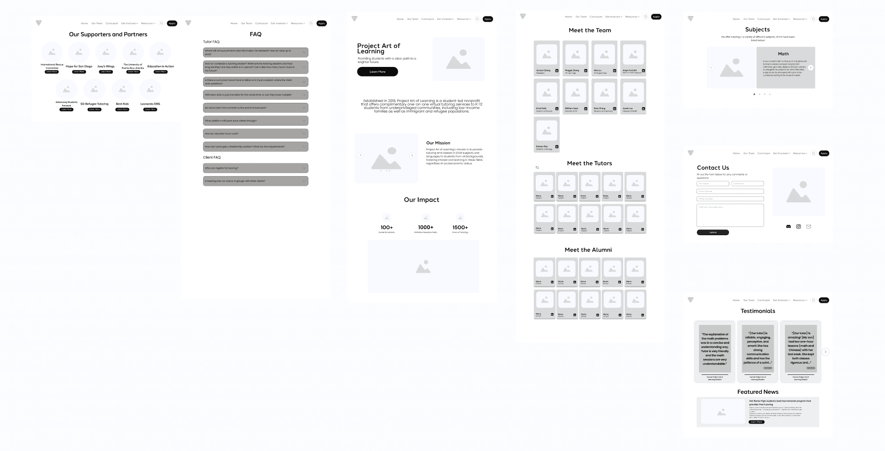
Visualizing solutions through low-fidelity wireframes
We created low-fidelity wireframes to map out key pages and ensure our content and structure aligned with user priorities. These early sketches helped us explore layout decisions, prioritize essential information, and define clear interaction flows for both students and tutor




MID-FIDELITY
Refining the Experience
We transformed low-fidelity wireframes into interactive layouts with clearer hierarchy, modular components, and intentional use of visual groupings.
VALIDATING OUR DESIGNS
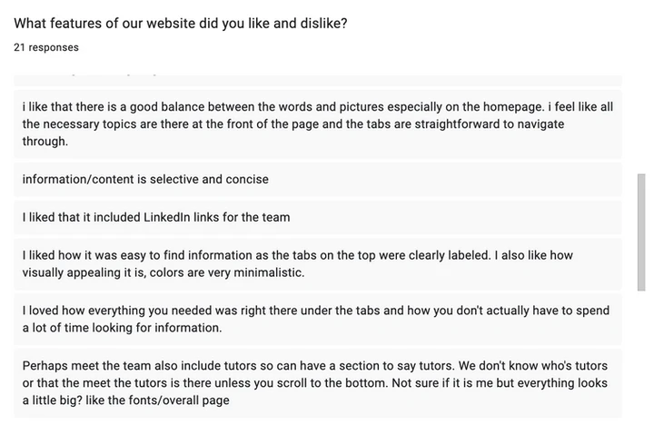
Feedback from users
We tested our mid-fi prototype through Zoom sessions and surveys with 21 users. Most found the layout clear and easy to navigate, but some pointed out confusion in the “Apply” section and missing tutor visibility. This feedback directly shaped our content clarity and navigation updates.

HIGH-FIDELITY DESIGNS
FINAL SCREENS
We focused on making each page feel clear and easy to navigate, whether someone is exploring the team, applying to be a tutor, or learning about the impact. Every design choice was shaped by user feedback and built to guide people through the experience.

I integrated an interactive map feature that displays the branch name and contact information whenever a pin is clicked.
Interactive Map
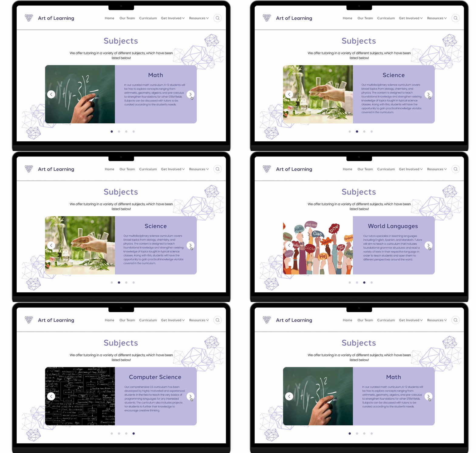
I implemented a carousel feature allowing users to slide through subjects, with condensed text and images
Curriculum
We've launched a fresh FAQ page to answer frequent inquiries concerning tutors and students, highlighting a collapsible section that shows responses upon click.
FAQ

LESSONS LEARNED
Discovering New Skills
This project was my first real dive into prototyping and design thinking and it changed how I approach problems. Turning early, unclear ideas into interactive, tangible flows taught me that great design isn't about getting it right the first time, it's about getting it closer every round. I walked away with a stronger creative toolkit and a sharper instinct for when an idea is ready to test versus when it needs another pass. Given more time, I'd push further into advanced prototyping methods to stress-test our ideas even harder.