Transforming a website to help bridge opportunity gaps and advance educational access for students across Vietnam.
Saigon Children
Role
UI/UX Designer
Timeline
Jan 2025 – Mar 2025
(10 Weeks)
Team
5 Designers
3 Back-end Developers
Tools
Mantine UI
Figma
React.js

THE PROBLEM
The mentorship platform lacked structure and accessibility
Disadvantaged students in Vietnam struggled to access reliable career guidance due to a disorganized, hard-to-navigate mentorship system. Without clear dashboards or efficient matching tools, mentor-mentee relationships were difficult to initiate and maintain.
BACKGROUND
The Design Problem
THE SOLUTION
Design a platform that makes mentorship accessible & intuitive.
Our aim was to redesign the Big Buddy–Little Buddy experience into something more structured, engaging, and scalable. We wanted to simplify the onboarding process, improve mentor-mentee matching, and ensure students in rural areas could access the platform easily.
DESIGNING
The Design Process
DESIGNING WITH CONSTRAINTS
We took an iterative approach to design a simple and intuitive dashboard tailored to SaigonChildren’s mentorship program. Through weekly stakeholder check-ins and user testing our design evolved based on feedback, constraints and real-world needs.
ITERATION & FEEDBACK
Key Iterations
FINAL SCREENS
From Figma to Finish
OUR DESIGN PROCESS
Refining What Already Worked
To balance quick timelines with stakeholder clarity, we adjusted our workflow to prioritize visual communication. Since we were building on an existing project from past quarters, we focused on improving the design—refining what worked, removing what didn’t, and aligning everything centered around our stakeholder.

KEY ITERATIONS
Designing with context, not just from scratch
Since this project built on previous teams’ work, we started with existing wireframes and flows. While functional, they lacked clarity and consistency.
Rather than redesigning everything, we focused on purposeful refinements. We clarified visual hierarchy, prioritized essential mentor-mentee actions, and simplified language across the interface.


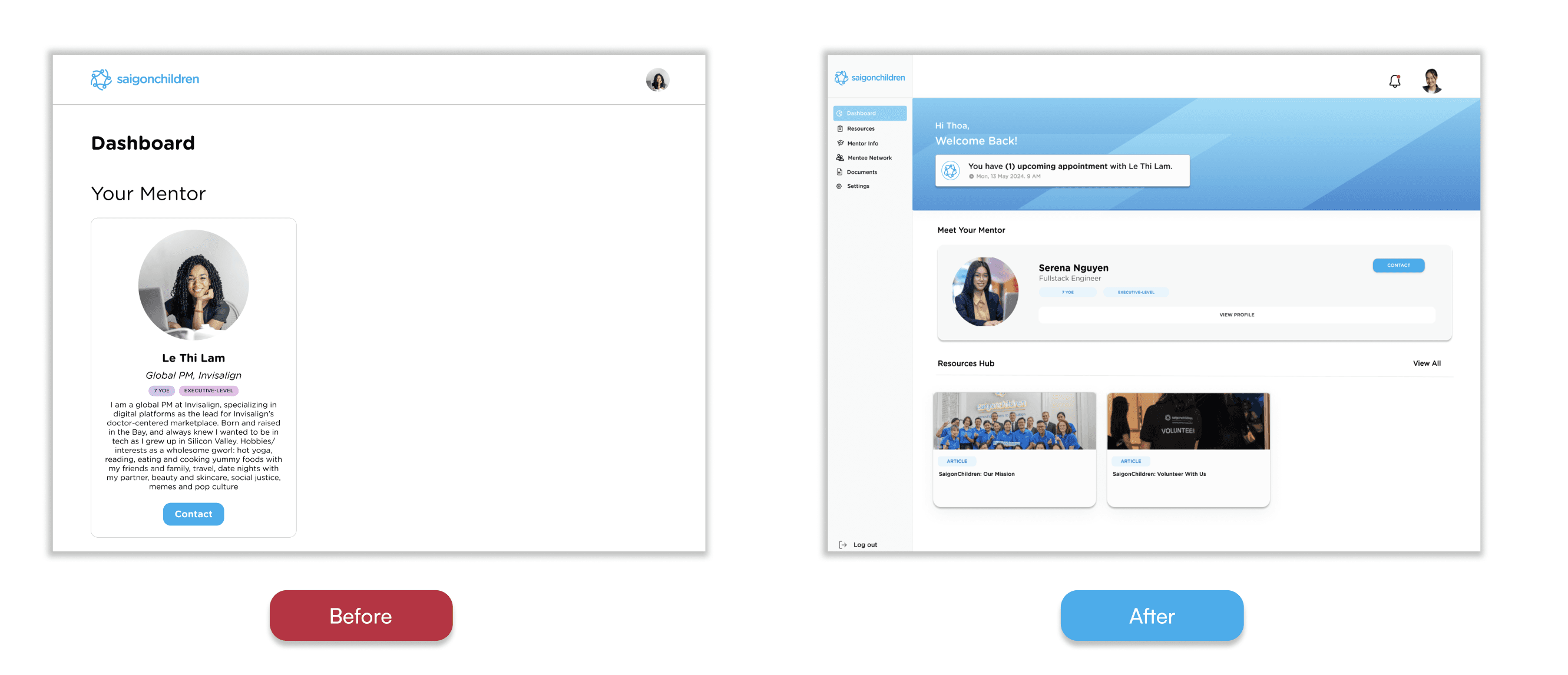


The original dashboard had a basic layout with only a mentor profile card displayed. It lacked navigation, visual structure, and personalization, making the experience feel static and text-heavy.
With a clear sidebar, friendly greeting, and neatly organized sections for the mentor and resources, the layout feels more approachable and helps users find what they need faster.
The original form felt cluttered, with too many fields displayed at once and inconsistent formatting that made it overwhelming to fill out.
The updated version is cleaner and easier to navigate, with a simplified layout that groups fields logically.
The original profile page was simple but text-heavy and had important details like hobbies or favorite books were buried in plain text.
This design separates content into clear sections and uses visuals like book and movie covers to make the profile more engaging.
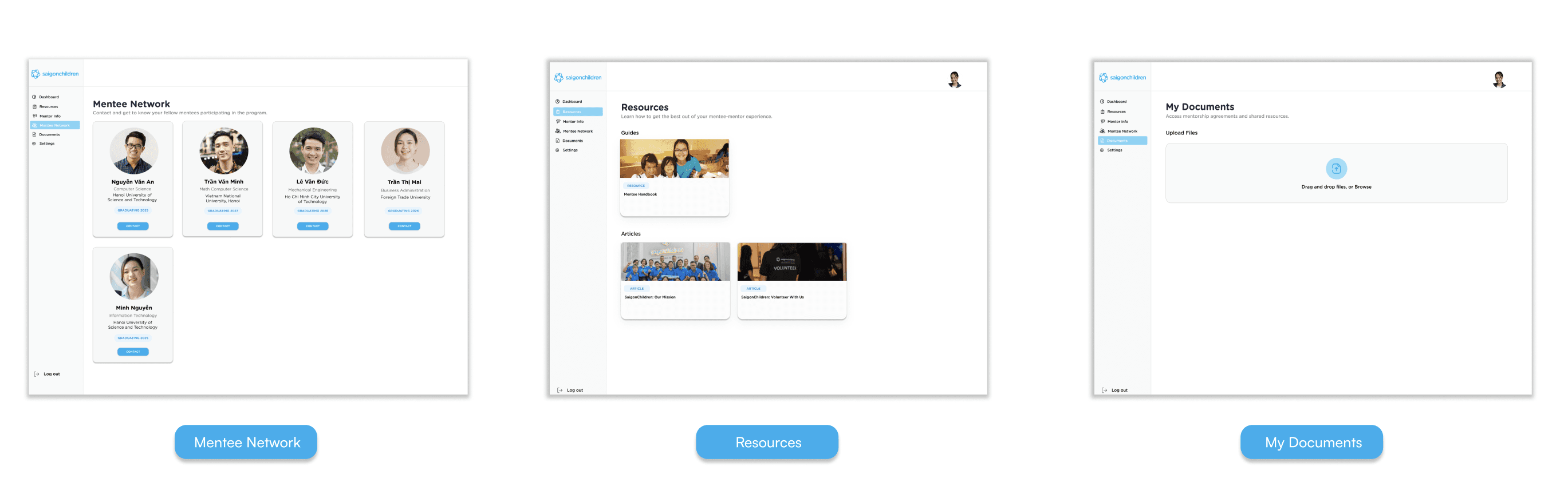
ADDITIONAL PAGES IMPLEMENTED
LOOKING BACK
Designing, Growing, Reflecting
LESSONS LEARNED
Designing with and for real people takes time — and intention.
Throughout this project, I learned that good design always comes back to the user. It takes more than just one pass. It's about constant iteration, attention to the small things, and staying open to feedback. Every decision, from spacing to word choice, played a part in making the experience better. I also learned how much good design depends on good communication. Working with stakeholders across a 15-hour time difference in Vietnam meant feedback came in asynchronously and plans sometimes had to shift last-minute, so I had to get comfortable communicating clearly in writing and staying flexible when priorities changed, all while keeping the project moving forward.